


Helping you to live a distraction-free life
Devansh had already created this beautiful & minimalistic app called Indistractable. I also had been using it for a while. I got the opportunity to create a Landing page for the app from Suhas.
We successfully designed, developed, and publish the landing page in a week.
Content Flow
The content was provided by my team members so that I can completely focus on the design as well as development.
Purpose:
• To create a landing page for the product that helps to showcase all the apps benefits, information, and screenshots together
Audience:
• Productivity geeks/people who are looking to get less distracted or looking to get their time back
Success looks like:
• Get more app installation & chrome extension installation through the landing page
Content Structure:
- Home Page
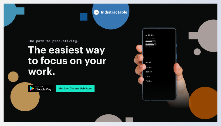
• Hero (Intro about the product)
• What is Indistractable?
• Why we're doing this - Story
• Demo of the product
• Benefits + Features
• Social Proof (testimonials from email + Twitter)
• About Us
Research
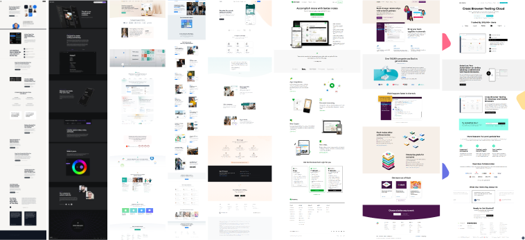
Researched a bunch of SAAs websites, which is also a bit minimalistic. It gave me an idea as to how the current content structure to the actual content on the website. I took screenshots of all the landing pages to help me in the design process.
Based on the research, changed the order of the structure to make sure a user understands everything the product does the moment he lands on the website and then provides other information which he might look at if he's more interested in it.
The Style Guide
Since the app itself was minimalistic, the landing page needed to be minimalistic as well. Chose a dark theme for the website to keep it minimalistic (Could have gone for a light theme. But ended up with a dark theme to make the images stand out on the website)
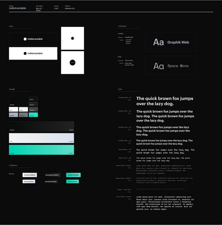
Chose a light bright green color as a primary color for CTA buttons (Wanted a color to stand out).
Regarding Fonts, went with Graphik Web for headings and Space Mono for smaller body text. Graphik Web has more x-height and a bit think font which is rightly suitable for showing headings bolder. Space Mono has the tech type feeling which correlates with the app, which is both tech and minimalistic.
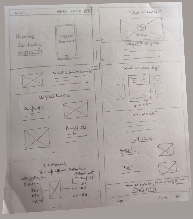
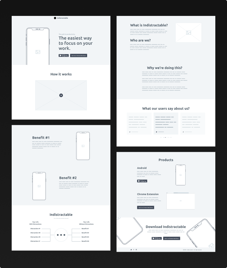
Wireframes
Based on the research and content flow, brainstormed the wireframes on pen & paper first and then converted that to high-fidelity wireframes on Figma.
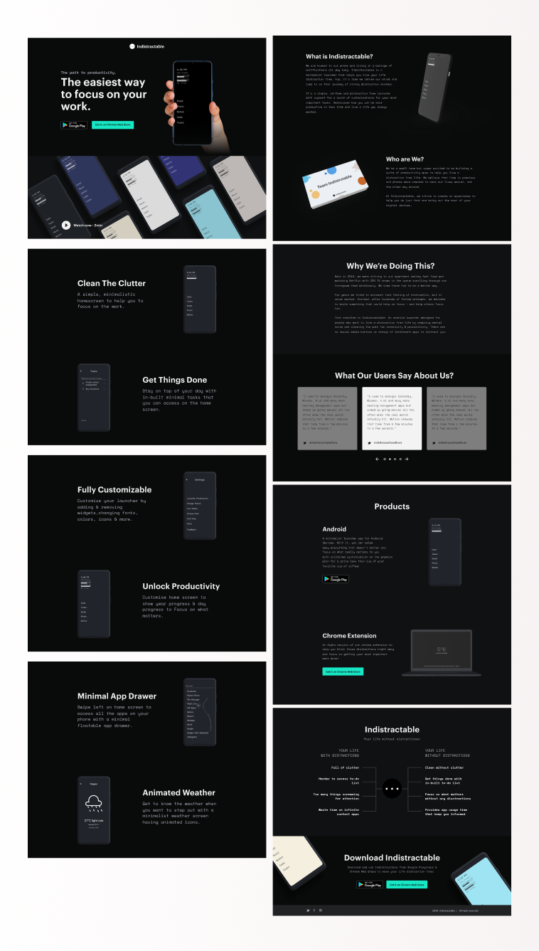
Converting Wireframes to Final Design
Since wireframes were already high-fidelity, adding original content to design the final website was easier. But, the hard part was to search for mockups that complement the website theme.
Website Development using HTML, CSS & Bootstrap
Recreated the style-guide first for faster website development and converted all the requirements from design to development. Also worked on responsiveness to make sure it's properly accessible in all screen sizes.
Added various transitions and animations to make the experience better.
Check out the website to see the full design of the website👇 Also, I've been using the launcher myself for quite some time. It's really great. Download, Install, and use it now.