


Helping early-stage communities to grow faster
I teamed up for a small project with The Product Folks. The Product Folks have built their community from scratch to become India's leading product community within the last 2 years. This is their effort to share everything we know about building a community and help others grow.
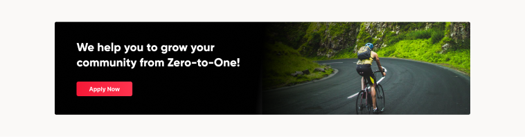
In order to help other communities, needed a landing page website that showcases all the things that they can provide. People who are building their communities and trying to grow land on the website, and fill the application form through the website.
Based on the applications, they filter out based on certain criteria and help the communities grow from 0–1.
Content Flow
The content was provided by my team members so that I can completely focus on the design as well as development.
Purpose:
• To help communities grow and have an impact in their domain/industry
Audience:
• Early-stage Community builders
Success looks like:
• Onboard 5 communities & 5 partners (for discounts/coupons/perks)
Content Structure:
- Home Page
• Intro about the community fund
• Why we're doing this - story
• About TPF
• Application process
• Application form
• Perks + Benefits
• Mentors + Social Proof (testimonials)
- Application Form
• Application form embed
Research
The task for researching was to find out how others in the community space are doing a similar kind of job and also to understand how they position themselves. Once, found out a bunch of such websites, took screenshots of all the landing pages to help me in the design process.
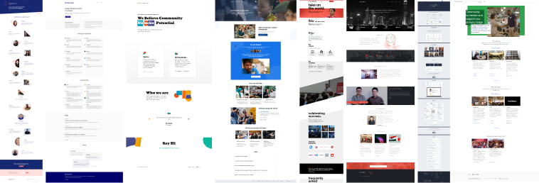
Based on the research, changed the order of the structure to make sure a user understands everything the product does the moment he lands on the website and then provides other information which he might look at if he's more interested in it.
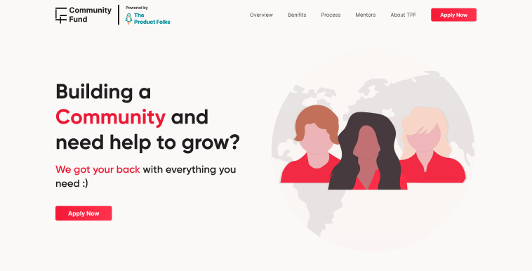
The Style Guide
The main aspect regarding the landing page was to think about how to position the website. Once, having thought about positioning, the content was given by the team to me.
The main aspect was to showcase credibility and also show all the benefits and features for the users upright without wasting much of their time. Choose a light theme with red as the primary color.
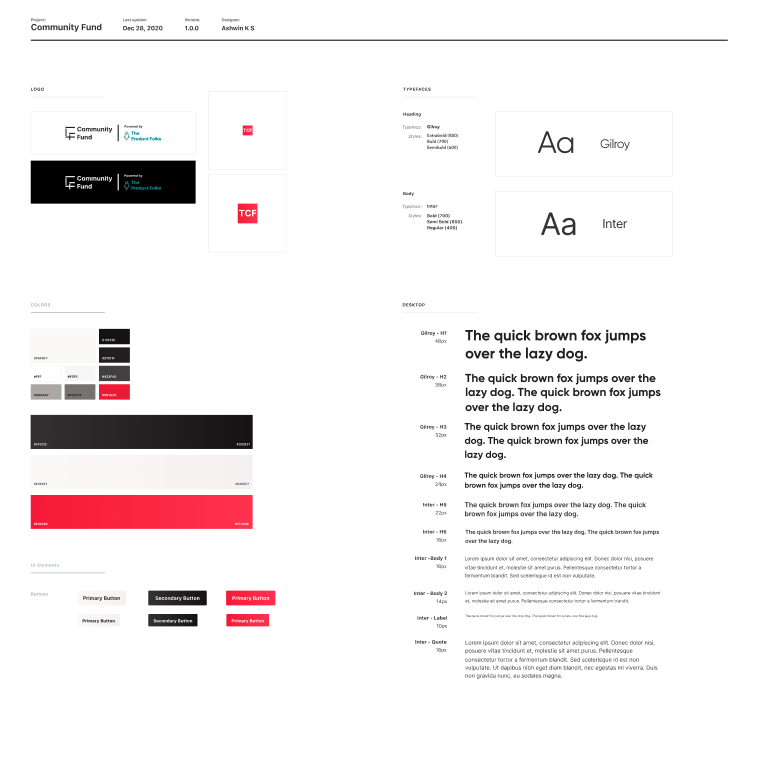
Since the theme was to showcase credibility, chose Gilroy and Inter as fonts (both have more x-height), which correlated well with the theme.
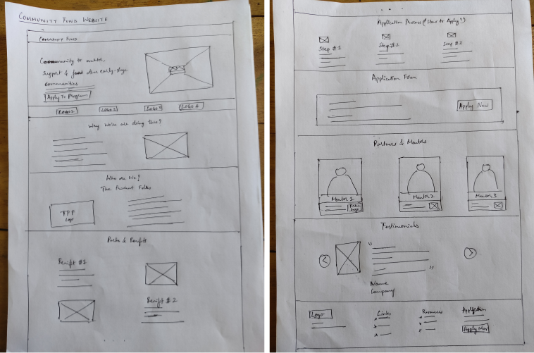
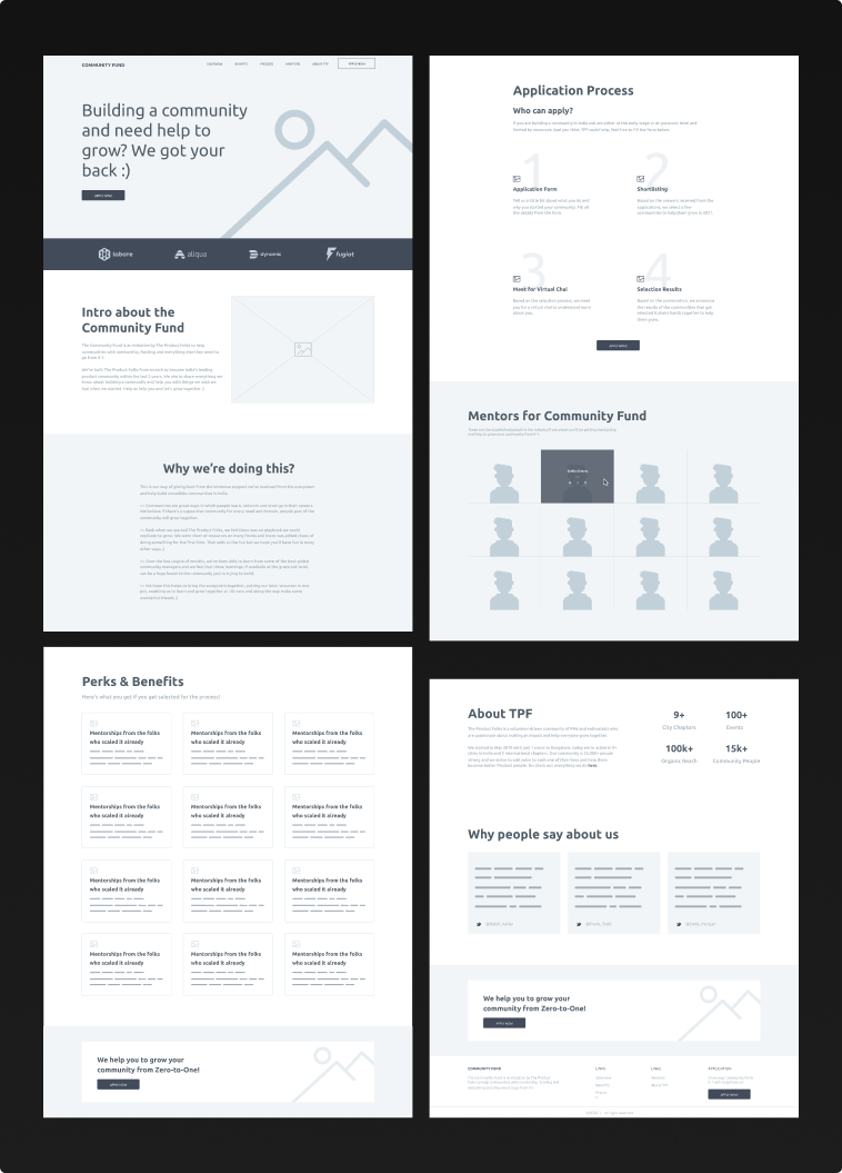
Wireframes
Based on the research and content flow, brainstormed the wireframes on pen & paper first and then converted that to high-fidelity wireframes on Figma.
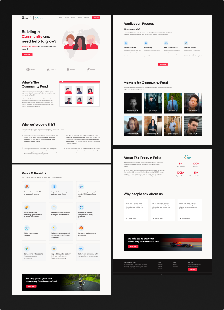
Converting Wireframes to Final Design
Since wireframes were already high-fidelity, adding original content to design the final website was easier. But, the hard part was to search for illustrations that complement the website theme and content.
Website Development using HTML, CSS & Bootstrap
Recreated the style-guide first for faster website development and converted all the requirements from design to development. Also worked on responsiveness to make sure it's properly accessible in all screen sizes.
Added various transitions and animations to make the experience better.
Check out the website to see the full design of the website👇 Also, if you're trying to grow your community in some area, please do visit the website and fill in the application form so that you might have a chance to get help and support from the product folks.